How to photo edit underwater pictures - the basics
2 - Correcting Color Balance
this removes some of the dominant blue so reds and yellows are back in balance - the scene is more as you remember
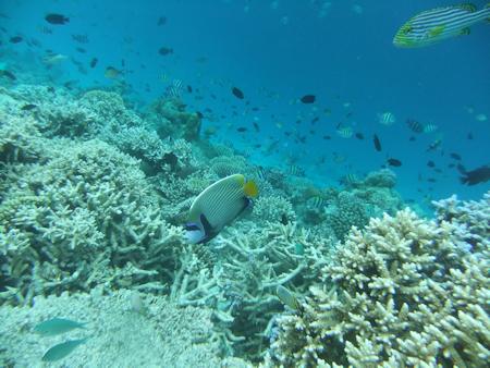
after post-processing but no colour balance adjustment
after post processing with 'auto' colour balance adjustment
With a good compact, one click autofix can be the simple solution
The pictures above show that a shot from a reasonable camera may only need a simple one-click of the
auto-colour balance feature available in many software packages.
Other post-processing in the photos above were identical ie saturation, clarity and sharpening.
Other post-processing in the photos above were identical ie saturation, clarity and sharpening.
Correcing color balance is one of the best post-processing tasks to improve your photos. Your
eyes are more discerning than a camera.
If the software doesn't offer specific, white balance adjustment, you have to use the very general '3 - One Step Photo fix', shown below.
If the software doesn't offer specific, white balance adjustment, you have to use the very general '3 - One Step Photo fix', shown below.
'One step' alters everything, not just colour balance. That might not be what you want?
Most packages offer colour alteration which is usually reduction of the blue. Sometimes it's too much red but the fix is quite similar. This approach is shown at the bottom of the page.
Most packages offer colour alteration which is usually reduction of the blue. Sometimes it's too much red but the fix is quite similar. This approach is shown at the bottom of the page.
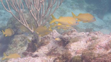
original picture with fairly good colours - shot on sunny day in 3 metres
a few French Grunts around quite a nice coral
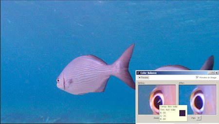
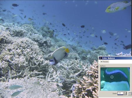
For color balance correction in PaintShop Pro there are 3 options.
Choose something which is unambiguously white, black or grey.
Choose something which is unambiguously white, black or grey.
In most photos you can find one of more of these colours. White seems to be the best to use if
it is available. Black is second best.
Grey seems a bit subjective.
Grey seems a bit subjective.
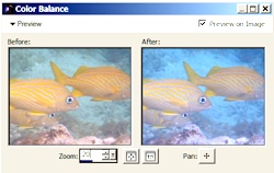
Choose your object by zooming in a bit (x20). Then pan/ move - the image
in the right hand box so the object you want to use, in this case the eye, is
dead centre of the right-hand box.
Then, zoom right in.
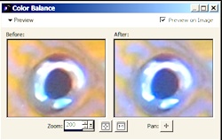
Here, zoomed to 200 (ie just added a 0 to the 20 already in the 'zoom' box - lower left).
Here, zoomed to 200 (ie just added a 0 to the 20 already in the 'zoom' box - lower left).
Then place the cursor in the left of the colour balance dialogue box pair of pictures. A little colour box will
appear (see picture below).
Move the cursor so that the colour shown in the tiny little lower right hand window is as close as possible to the colour you want.
In this case I was seeking as close to white as possible on the left picture below and as close to black as possible on the right picture below.
Move the cursor so that the colour shown in the tiny little lower right hand window is as close as possible to the colour you want.
In this case I was seeking as close to white as possible on the left picture below and as close to black as possible on the right picture below.
The more the colour is 'away' from what you are seeking as shown in the little box, the more colour correction
will take place.
You want to find something as close to pure white or as close to pure black as possible. Eyes are often black in the centre. Most pictures have some white somewhere.
'White' led to colours as I remembered but that is not always the case.
You want to find something as close to pure white or as close to pure black as possible. Eyes are often black in the centre. Most pictures have some white somewhere.
'White' led to colours as I remembered but that is not always the case.
I often try to find and use white for reliability, but black is often the choice.
The picture on the right is only slightly greener than the original, (which was shot on a sunny day in fairly shallow, clear water, so light and resultant colours were pretty good to start with).
The change using white is very subtle (left picture) but the coral seems to be coming up quite nicely. A bit more 'coral' pinkish/ brown.
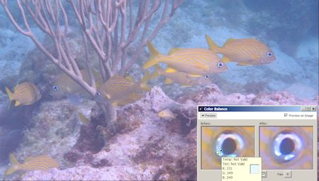
colour balance change by choosing white of eye surround
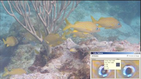
colour balance change by choosing black of eye pupil
Some other examples
Below, original shot too near the surface in underwater setting mode. Tried the white of the eye but
the black of the eye produced the more realistic colour with less red (right picture).
The fish on the left might look 'prettier' but the picture below which used the black of the pupil a
s the colour reference point reflects more realistic colours
of the Chub.
Below . The original shot with a very basic camera set to auto white balance.
What a shocker. Everything has this blue-green tinge and it all appears to be very flat.
What a shocker. Everything has this blue-green tinge and it all appears to be very flat.
The change is dramatic. The black worked better than the white, although the adjusted
colour is still too blue-grey.
Below is more how it looked. Less blue-green with lots of pale, and some 'bleached', corals. Nowhere near good enough though.
Below is more how it looked. Less blue-green with lots of pale, and some 'bleached', corals. Nowhere near good enough though.
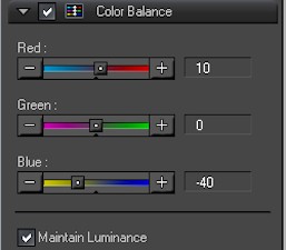
No PaintShop Pro but software with a colour balance wheel or scale!!
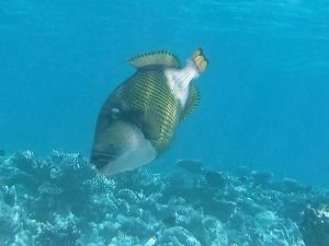
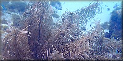
Orginal below totally dominated by blue.
A more basic colour balance alteration using the software that came with the camera. But, check the web for free photo editing software first.
A more basic colour balance alteration using the software that came with the camera. But, check the web for free photo editing software first.
Software scales shown below.
Just dial out the blue either against the red and/ or the yellow to get the colours close to how you remember or want them.
Just dial out the blue either against the red and/ or the yellow to get the colours close to how you remember or want them.
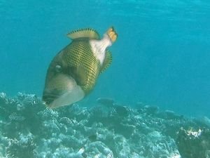
The colour adjusted photo below.
Harder to do using scales but better than not doing anything with the Titan Triggerfish? Is still too much blue but at least he is olive and whitish.
Harder to do using scales but better than not doing anything with the Titan Triggerfish? Is still too much blue but at least he is olive and whitish.